My Organizational Toolkit: Updates for 2021
As usual, with the new year, I’m re-thinking how I organize my life. I love organization and productivity tools, and while I try not switch between tools too often, there’s always a temptation to optimize my workflow a bit more. You can check out last year’s workflow here.
I’ve made some big changes from 2020. I’m no longer using Evernote (!), Things3, or Coda, and I’ve started using Notion and Dropbox. In general, my priorities are speed, functionality (especially the ability to customize and link different resources), aesthetics, and supporting creative and ethical companies.
Disclaimer: I enjoy organizing things, and I find this process relaxing and calming. This is just the way that I personally cope with all the many tasks and papers and people in my work life. Especially in the last year, “productivity” might not be a healthy goal for lots of people. For me, these apps are a fun distraction from the 2020 chaos, but that is probably not true for everyone. I like sharing what I use and how I organize things because I learn a lot from other people who share their workflows. We all have to find our own methods for dealing with work. Take what works for you, leave what doesn’t!
Notion
The biggest change to my workflow in 2021 is that I finally made the switch to Notion. And I’m obsessed!

I’ve used Evernote for 10 years and have relied on Things3 for my to do lists for three years. I love both of those applications, but I’ve found that Notion can combine their functionality and is more effective for me. I still have a lot stored in Evernote (the auto import to Notion is very broken), but I’m slowly moving everything to Notion.
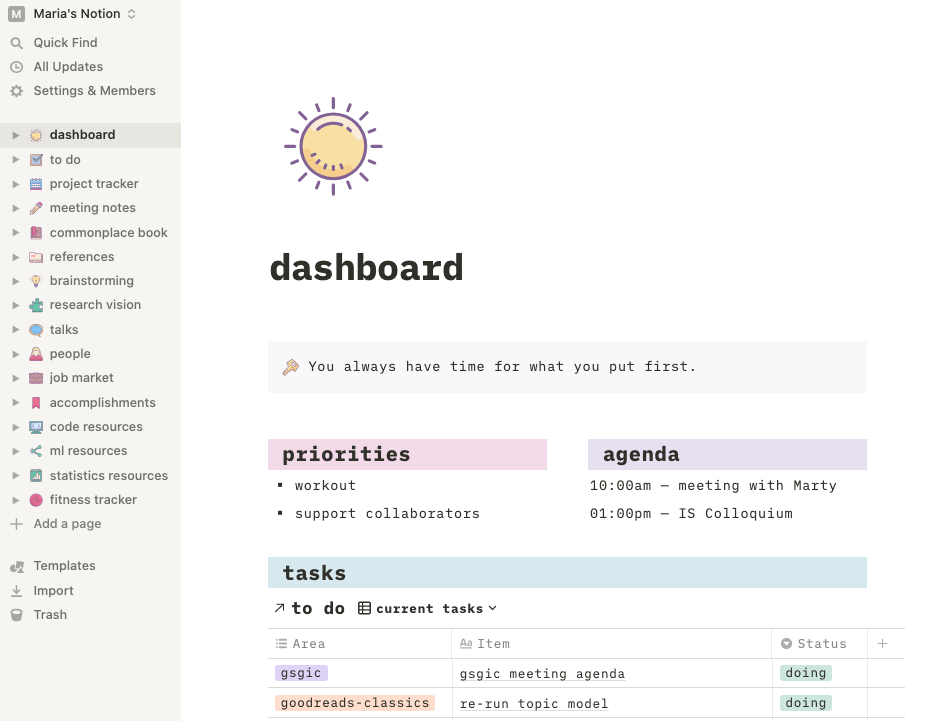
What finally sold me were (a) the extreme functionality of the tables (Evernote doesn’t come anywhere close) and (b) I realized I could replace all the ugly default icons with any images I wanted. I look at this app everyday, so aesthetics are important! I’m currently using the “Cute Color” icons from Icons8.
Some of my Notion pages include:
- a dashboard (shown above) with my daily to do list, daily schedule, and weekly goals
- a master to do list, which I can view as a calendar, kanban, or filtered list and set reminders
- meeting notes for all my different projects
- databases for all my literature reviews
- a database of people I interact with at work (because I’m terrible at names and meet a lot of people on Twitter, at conferences, etc.)
- notes from talks I’ve attended
- technical notes on different machine learning models, stats methods, and code snippets
- a growing document where I try to explain my research vision
- brainstorming notes, organized by category
- a list of my accomplishments by year (maybe sounds silly, but it’s a list of happy things that helps me when I’m feeling discouraged)
- a “commonplace book” for quotations and interesting tidbits that don’t fit elsewhere
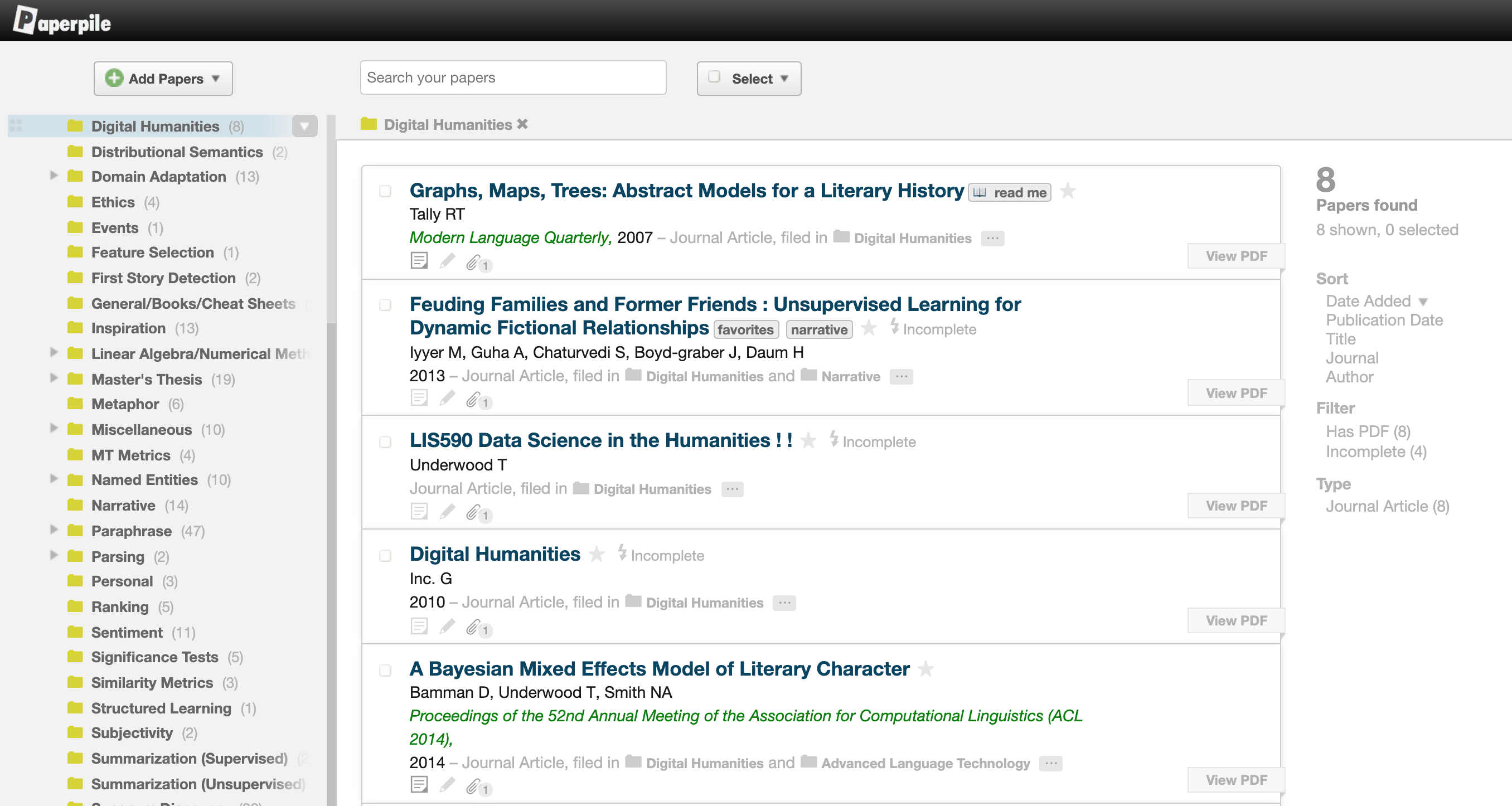
Here’s a look at one of my references databases. You can sort, filter, link, and view these databases in different formats.

If that all sounds intimidating or you’re not sure where to get started, there are tons of YouTube tutorials sharing inspiration and how to use different templates.
Pros
Free. Functional. Beautiful. Has actually made me more productive (mostly because of the to do list linked to my dashboard). Can easily export tables to CSV and notes to Markdown.
Cons
Privacy is a potential concern (no encryption). There are some very minor UI changes that I would prefer (e.g., I always want pages to open in full screen).
Paperpile
I agree with my previous assessment that there is no perfect solution to paper management, and I still use Paperpile as the best available option. I’m increasingly annoyed with being tied to Chrome, and I wish the UI would get some updates (it looks cluttered to me). But I don’t know of anything better, and I want to keep supporting this competitor to Mendeley.

As before, I use Paperpile for management of PDFs, but I keep a separate spreadsheet to organize references for specific projects. For each new project, I create a Notion database (formely a Google Sheet) where each row is a relevant paper and the columns include the title, authors, publication year, publication venue, topic, subtopic, and notes.
I’ve also started using Are.na (see below) for my first round of gathering papers. It’s the quickest way to gather papers, and then they’re arranged visually in a nice board. I like to use this as a filter before adding things to Paperpile because otherwise, papers get lost in Paperpile and I forget to read them.
As before: this system isn’t perfect, and I’m going to keep experimenting and looking for a better solution. But for now, this is working.
Pros
Not owned by Elsevier. Decent UI, a bit clunky but better than the alternatives.
Cons
No offline access to papers. Only runs in Chrome. Buggy.
Are.na
(Mostly the same as last year, but with increased love! This is my favorite social/creative website by far.)
Are.na is a Pinterest competitor that advocates for a healthier, “slower” vision of the internet. I’ve used Pinterest for years, but Are.na has a much lovelier, more minimal UI and is subscription-based instead of using advertising and your data for revenue. There are no ads, likes, or recommendations. I just love everything about this company.

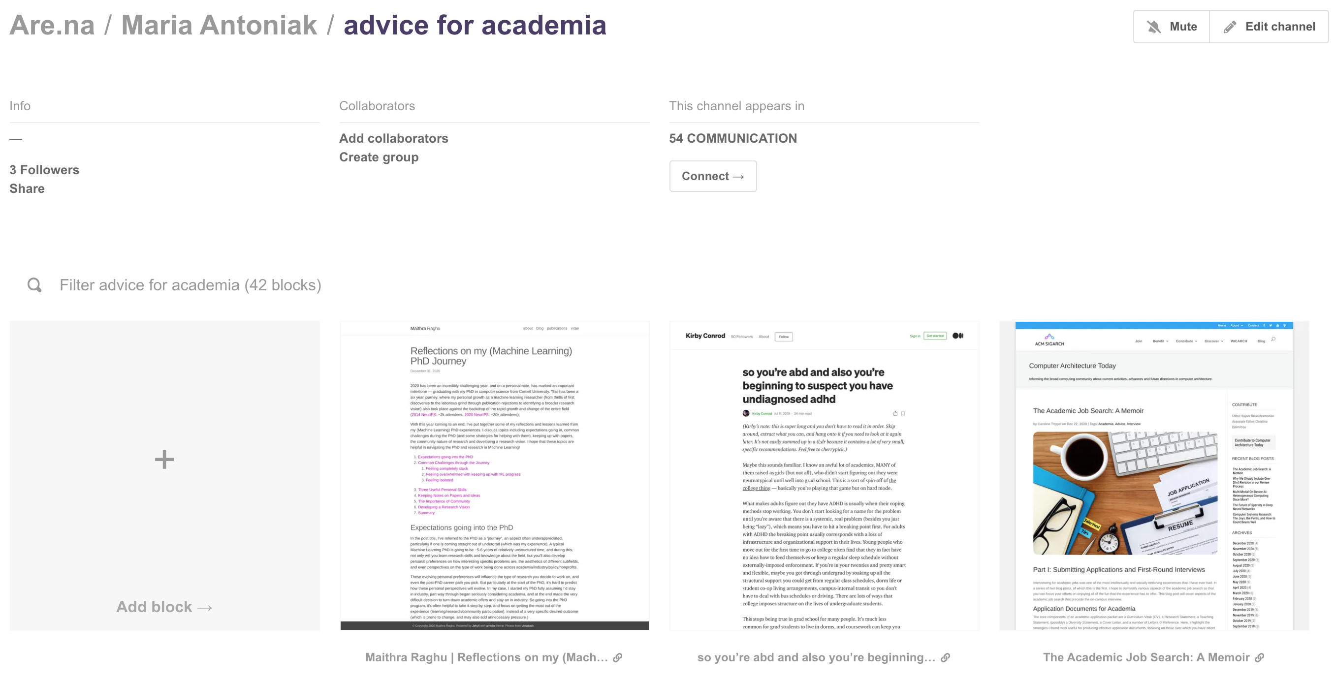
For example, I maintain an Advice for Academia channel with articles and information about how to survive and succeed during and after the PhD. It’s a quick and easy way to visually gather and share information.
I still use Pinterest for some things (e.g., following certain influencers), but I mostly prefer Are.na’s aesthetic, functionality, and mission. This year, I’ve also started using Are.na to collect papers, as described above.
Pros
Ethical mission. Minimal and very pretty. Lots of inspiration. Extensions have been improved.
Cons
None.
Dropbox
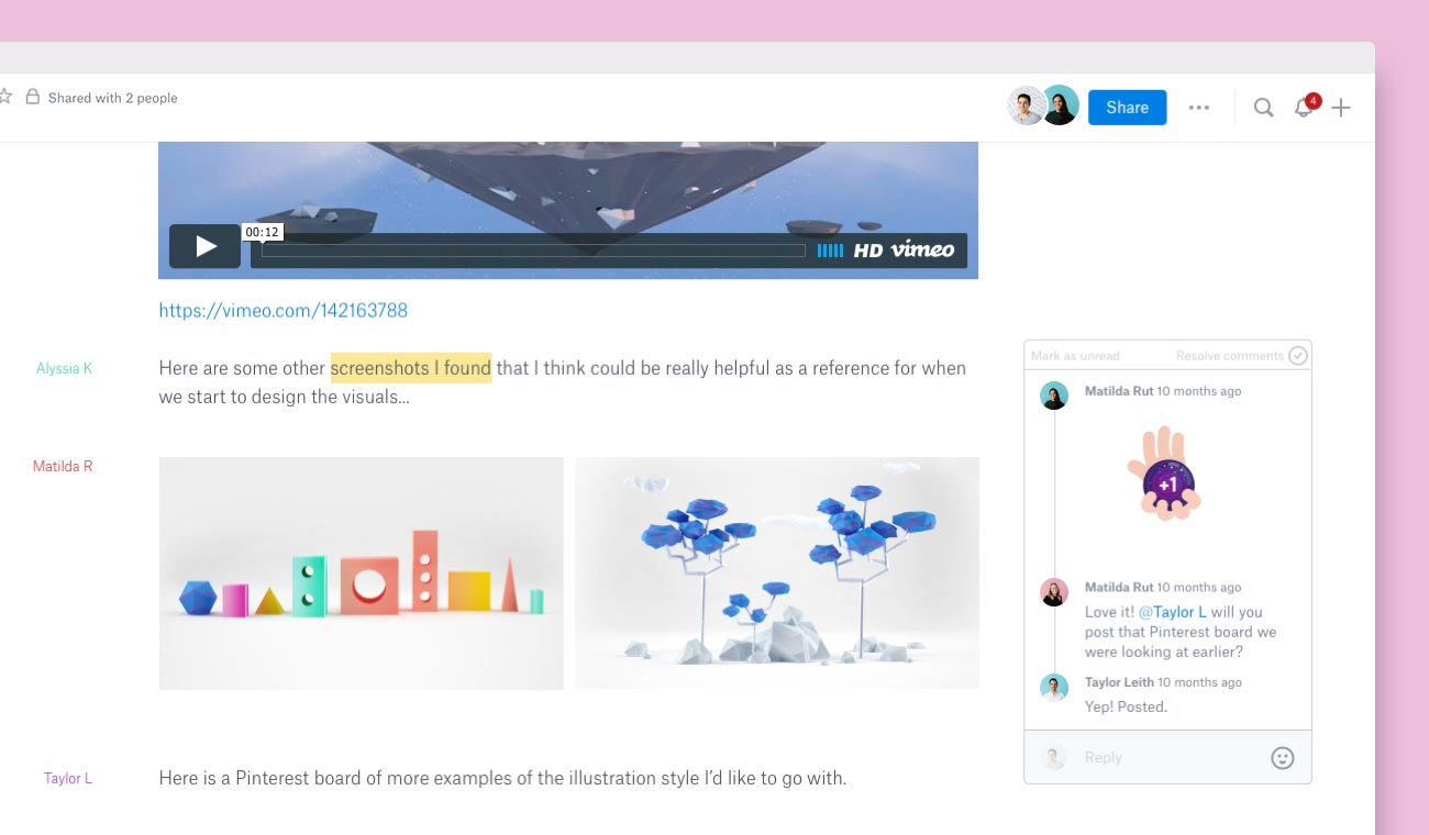
This one is a huge surprise to me. I haven’t used Dropbox for years, instead relying on Google Drive for all my shared documents and cloud storage. Katherine Lee suggested I try it out, and I’m so glad she did! The improvements from 10 years ago (ha!) are huge, and their new collaborative documents, called Paper, are far faster and more beautiful and functional than Google Docs.

I’ve been using Dropbox for most of my collaborations for the past few months. Anything that I want to share with my collaborators (data, project overviews, meeting notes, etc.), I put into a shared Dropbox folder. This is definitely still an experiment, and one downside for me is that I end up with duplicate notes in Notion and Dropbox, but so far, I’m really appreciating this new-to-me tool.
Pros
Free. Lots of storage. Faster than Google Drive. More beautiful than Google Drive.
Cons
There have been privacy concerns in the past, ironically for scientists and academics in particular. Impossible (for me at least) to completely leave Google Drive, so now I have documents scattered across both services.
February 06, 2021